ShoutLife.com - A Fresh Approach to Social Networking
The Beginning
Rewind the clock to a cold November day, in 2006. Steve McLellan and I decided to take a break from work at Service Lighting to grab some lunch at Buffalo Wild Wings in Champlin, MN. During our lunch, Steve, who had a history of running community driven networks said, "Paul, you should totally make a social networking site that is open to the public."
Prior to this, Steve and I had dabbled in a small-scale dating site called MatchParadise.com, and I had spent the past 15 months working on an alumni site for the college I went to.
"Sure", I thought. "Sounds like a fun idea but it probably won't turn into anything."
PICKING THE RIGHT NAME
We needed a name, so that night we were emailing each other back and forth, trying to come up with something. If we were going to make a social network, we wanted a positive spin (we were focusing on making a family-friendly environment), so we tried lots of buzz word combinations, looking up synonyms for "fun", "happy", "space", "world"... believe it or not, "vim" and "verve" were contenders. :| Eventually, Steve picked from the word list and checked to see if "ShoutLife.com" was available. Much to our surprise, it was, so on November 8th, 2006, we registered the domain and came up with a logo that utilized a megaphone/sound-wave design:
I started porting over a custom alumni site I made for my college, while adding in lots of fun new features. The core system (sign-up, profile management, upload photos, send private messages) was there but I needed to make it more publicly accessible and give it a visual face lift. During this time, I called my brother-in-law Steve Schletty to ask if wanted to be part of our little side project as he is a prolific programmer and graphic designer. After a few days, I had a working model up and on November 19th, I posted the first blog on the site, titled "ShoutLife.com open for users". I initially posted some links on the alumni site, emailed friends and family and we saw about 100-200 people sign up in a couple days.
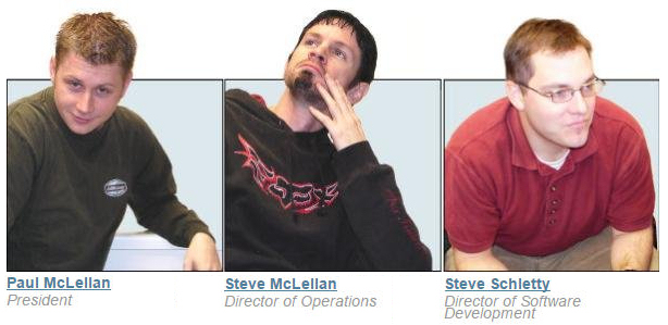
When we first launched the site, we wanted to get a quick "About Us" page, so people knew that this was a "friendly" website that wasn't heavy in the corporate scene. As a result, we didn't put too much thought into our photos and went super-casual. At this point, Hauns had not yet signed on as a partner, so we had just the three of us.
A few days after launching the site, we realized that this could actually turn into something, so Steve McLellan and I called our mutual friend, Hauns Froehlingsdorf, who had worked for years as a systems/server administrator. We called him and his wife Laurie answered. As we explained what we were working on, she was super excited about the idea and wanted to help wherever she could (she would end up being an extremely important part of our growth as she was vital for so many of our community/social events outreach).
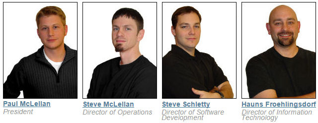
Hauns jumped on board and several weeks later, as the site took off, we felt the need to be a bit more professional. So with this one "About Us" update, we went with the "Steve Jobs-black shirt" look:
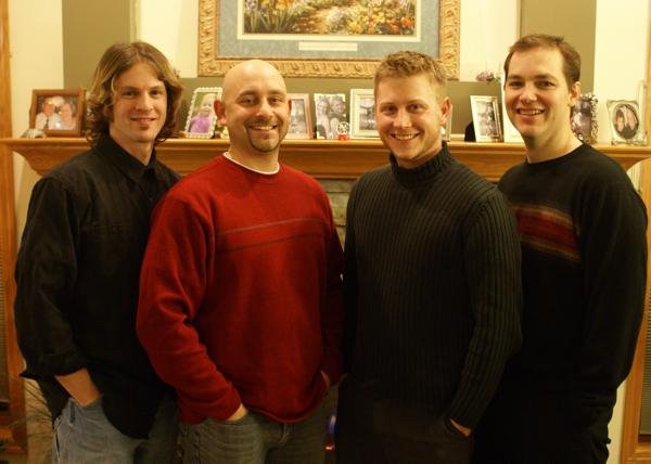
Finally, we enlisted the help of a photographer to help legitimize the look of our operation. This was the final iteration of the "original four", as pictured on our "About Us" page:
Here are a couple additional photos from the photo shoot. The first shows a nice level of casual professionalism, while the second one shows our true natures coming through:
MASHABLE PUTS US ON THE MAP
I knew a few people in the Christian media industry, so I emailed Robin Parrish, who at that time was running a site called Infuze. He was enthusiastic about the site and posted a link on his site which got us an immediate uptick in sign-ups! Over the next couple months, we were seeing some Christian music artists sign up (we had created separate stylized pages for music artists, comics, authors and organizations). These music artists brought with their own fan base as they were posting on their MySpace pages (remember, this was before Facebook was mainstream) to come over and hang out with them on ShoutLife. We were thrilled!
After we had several thousand members, we somehow got the attention of Pete Cashmore, curator of the well known social news site, Mashable. He proceeded to write an article, entitled "ShoutLife - Excellent Christian MySpace". I even had some very nice email discussions with Pete, discussing design elements as he gave me tips on making it a better social experience.
After he posted the link, the users came in like droves and we had a genuine social network on our hands! At this point, we had many Christian music artists that were genuinely interested in supporting our project, and they ended up providing us with glowing endorsements that helped legitimize our organization:
SITE FEATURES
Now that we had a real audience, I started working feverishly on getting the features built-out, so we could stay relevant and on top of our game. Our core goal was building a strong community, and making sure everyone felt connected. We didn't want to make a copy-cat site, but rather a social networking experience that was original, intuitive and fun. I also re-designed the top-navigation bar to make the site appear more current:
Some of our core features were:
Sign-Up -"Personal" account options as well as "Music", "Comedy", "Author" and "Organization"
Guestbook - leave simple public messages for others
Blog - you could have your own journal attached to your profile; this was like a long-form version of the Facebook "Status Update" we all use today
Shout-Mail - our branded private messaging, with comical language filter built-in
Live Chat - this was a big hit; lots of different moderated chat rooms to eventually include video
Events - aggregate of all events that each non-personal account would maintain, allowing it to be geo-targeted to the user
Multi-media - we integrated a third party MP3 streaming console for music artists and a video uploader/player for all users
Groups - picture a message board on steroids; each user could create categorized groups, and could completely customize security, CSS/layout, etc... a very in-depth and popular feature
News Feed - once logged in, we would take all of the new data (blog, comments, photos, videos) from your friends and display it for you. Keep in mind this was before Facebook was mainstream, and MySpace didn't have much of a news feed, so I'd like to ask Facebook to pay up some royalties for using this concept. ;)
Apparel Store - we had a lot of fun creating branded clothing and selling it on our site. We also made hundreds of t-shirts that we would hand out at festivals, trade shows or concerts.
Profile Pages - this is where most people spent their time. The profile pages allowed for a lot of customization and interaction; you could select from pre-defined color themes or create your completely original design. We also allowed for CSS insertion (insert MySpace ugly profile comment here) as well as custom header graphics, backgrounds, etc...:
TECHNICAL DIFFICULTIES
It wasn't easy making a site that gained traction so quickly. After a few months, we we the victims of several hacks; none of us had any experience building up a site that had such a large amount of traffic, so SQL injections, cross-site scripting and other issues kept cropping up. Let's just say, we had to learn quickly!
Aside from nefarious attacks, we also had performance issues. At first, we were running on a standalone server, but we knew that wouldn't cut it, so we moved to a load-balancing, multi-server approach. We still found ourselves purging old data just to free up space and constantly re-developing our scripts to save milliseconds of processing time.
Any time you have a community website that is attempting to be family-friendly, you become a target. We (primarily our wives) had to constantly filter private messages and even had a hilarious language filter built in, to replace obscene words with random childish phrases. We also manually verified every photo uploaded to ensure nothing pornographic or offensive was uploaded.

GMA WEEK
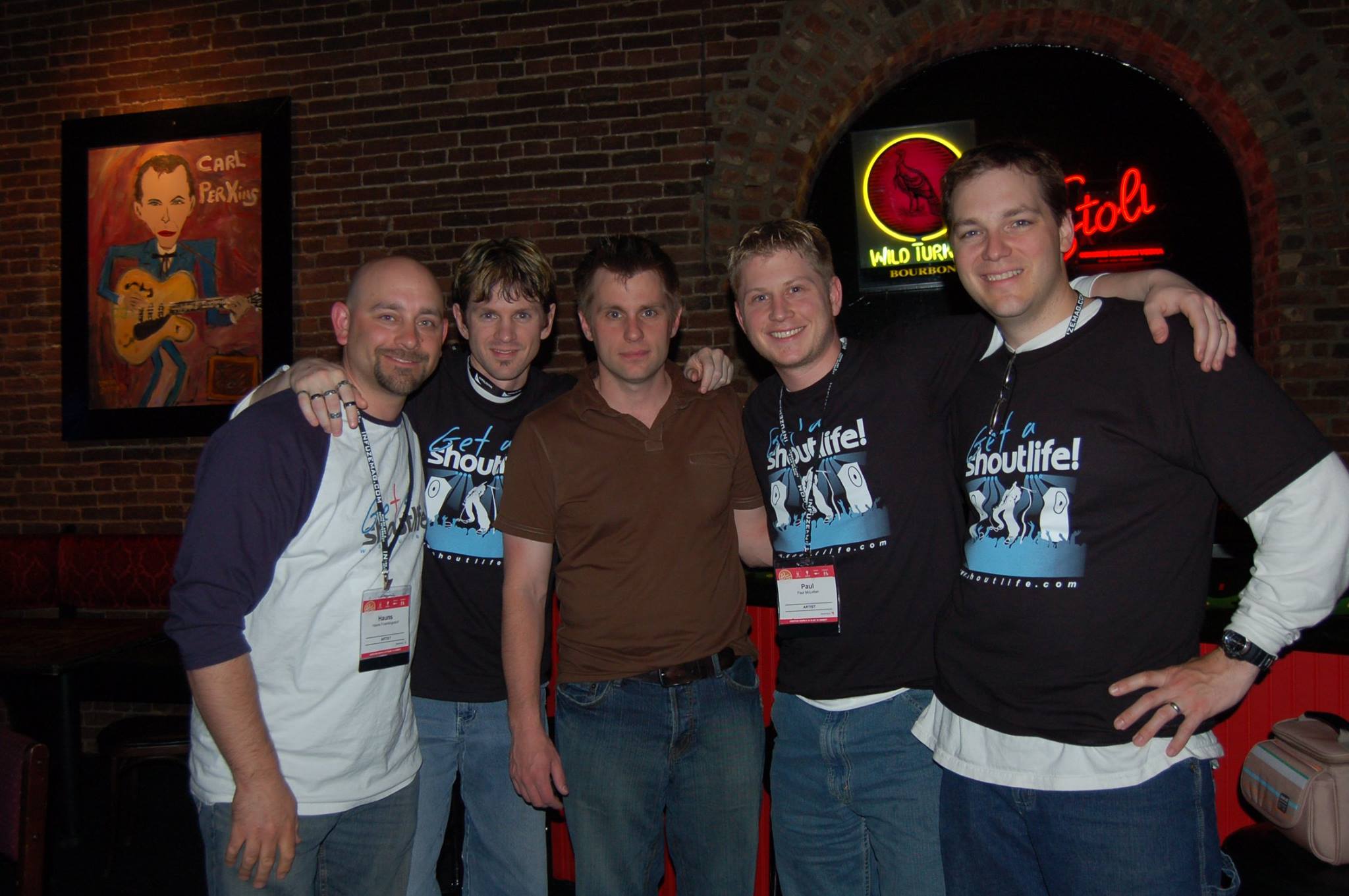
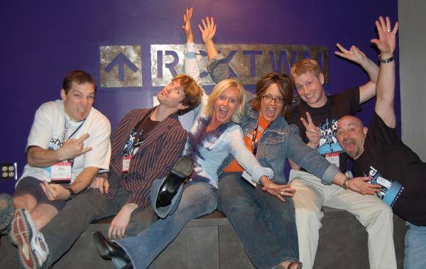
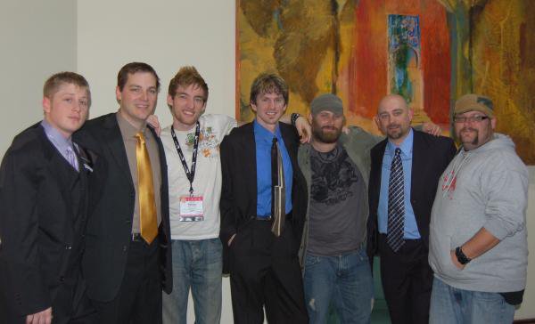
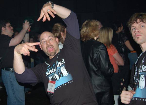
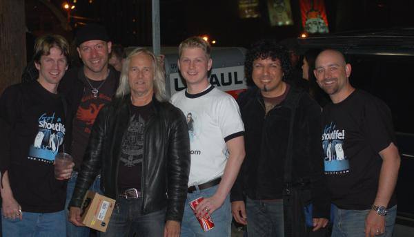
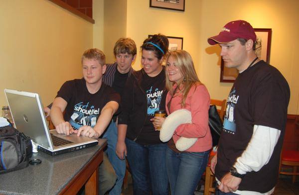
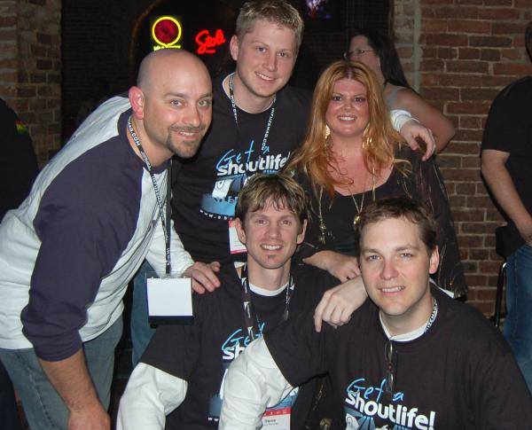
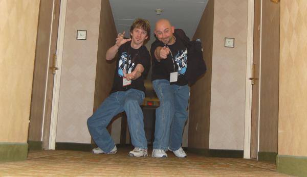
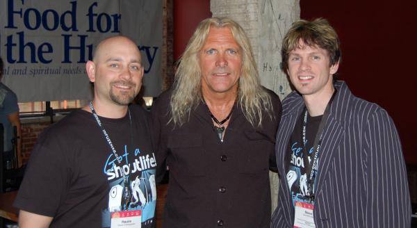
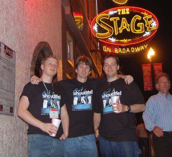
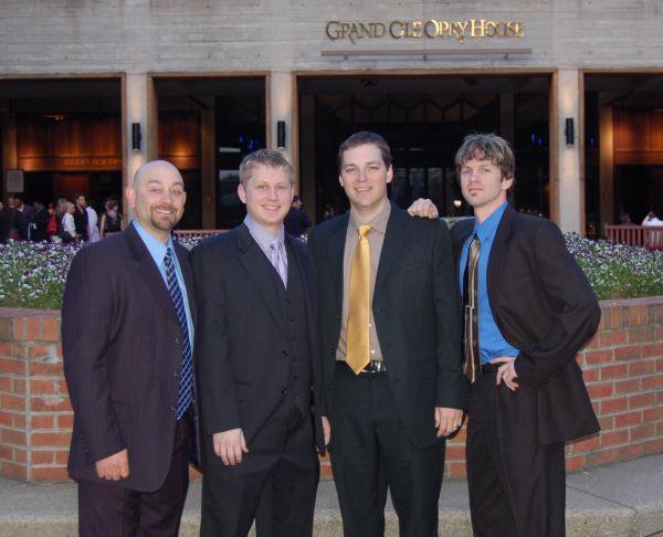
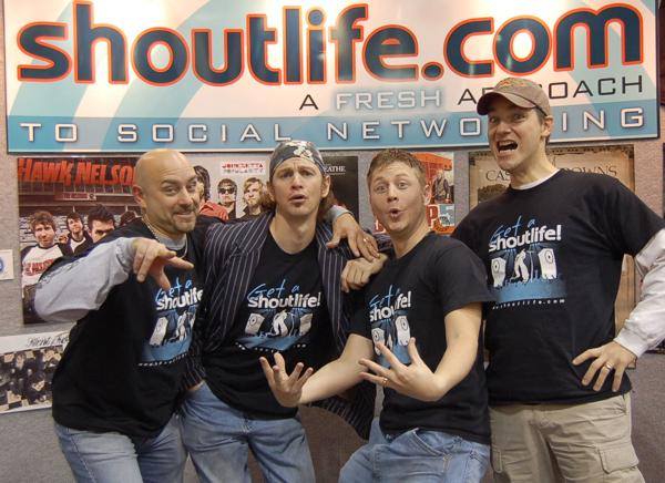
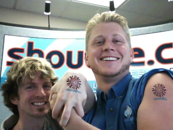
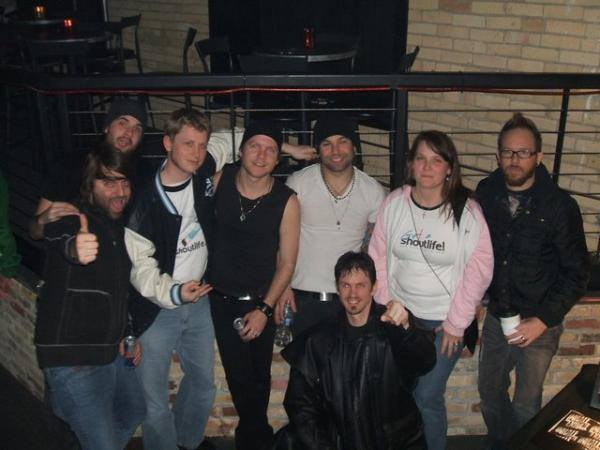
In April of 2007, only 6 months after we had launched, we flew down to Nashville, TN for GMA Week (Gospel Music Association). We did this to create more buzz for our website with the music artists who had already signed up as well as partner with relevant entities.
What followed was one of the funnest weeks of my life. Lots of late nights, laughs and great music.
We also ended up hiring Nashville Publicity Group to handle all of our PR and advertising.


FESTIVALS AND CLUBS
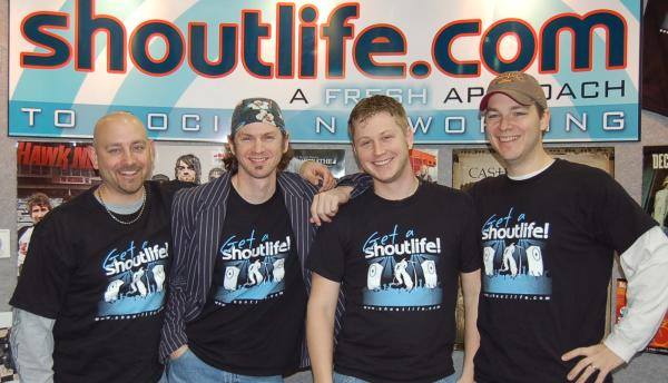
We spent a good deal of time at local music festivals (Sonshine, Lifelight) and night clubs, connecting with more CCM acts, comedians, and signing up lots of new users.
This was a lot of fun because we were able to meet in person a lot of the music artists and comedians that had been building a following on our site!
1 YEAR ANNIVERSARY
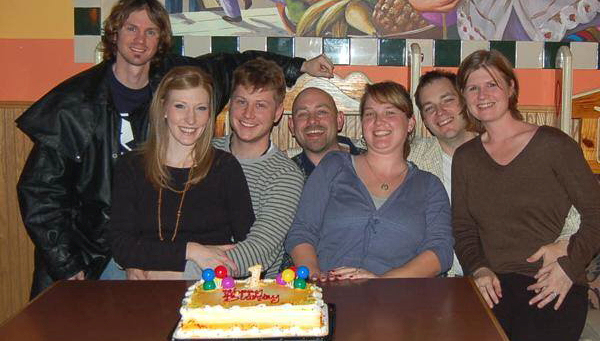
After our first full year online, we took some time off to celebrate with our wives. One of the best parts of ShoutLife was the many memories of just enjoying the ride! :)
We had several individuals that would come and go to help support this site along the way: Henry Camacho, Chad Pedersen and Mike Morrone were three key folks that really helped us out.
In summer of 2008, both Steve Schletty and I left ShoutLife to focus more on our day-job (all of our work with ShoutLife was done on nights and weekends) and Steve McLellan followed about a year after that.
For the rest of ShoutLife's time online, Hauns and his wife Laurie kept ShoutLife alive and well until it closed for good in March of 2014. From day one, it was a "free site" that operated only on donations or selling related ad space to family-friendly advertisers. When the site was shut down, there were approximately 250,000 registered users.
FAREWELL
To have been a part of ShoutLife was a chance of a lifetime. We took a fun and original idea and made it into a reality; a social networking COMMUNITY that impacted hundreds of thousands of people.


